Alright, don't be intimidated by the fancy name – the MACD (Moving Average Convergence Divergence) indicator is like your trusty fitness tracker in the trading world. Let's break it down, everyday-style!
1. *Fast and Slow Moving Averages*: Imagine you're wearing a fitness tracker. The fast-moving average is like checking your daily step count. It gives you a quick look at your short-term activity – how many steps you've taken in the last hour or so. Now, the slow-moving average is your monthly fitness report, showing you the bigger picture of your long-term health and activity trends.
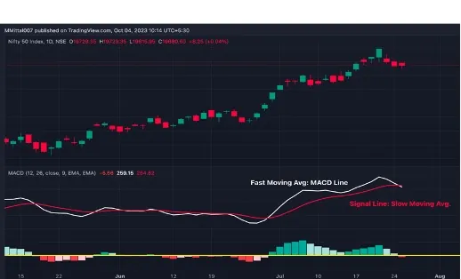
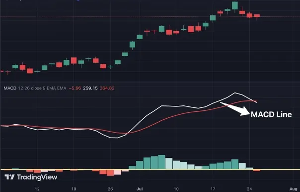
2. *MACD Line*: Now, the MACD Line is simply the difference between these two step counts. It's like subtracting your current hourly step count from your average daily step count. This tells you if you're ramping up your activity or slowing down
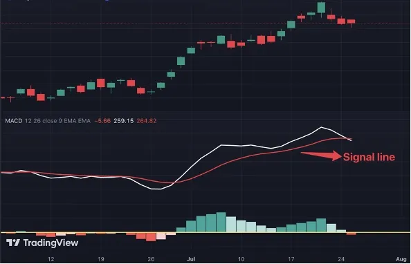
3. *Signal Line*: Think of the Signal Line as your fitness goal. It's like the target number of steps you aim for daily. This helps you see if you're exceeding your goal or falling behind.
4. *Histogram*: This is where it gets even more intuitive. The histogram is like a graphical representation of change in the pace of your steps. When it's rising, it means you're increasing your pace – like taking more steps per minute. When it's shrinking, you're easing off, possibly taking fewer steps.

Now, let's put this fitness tracker to good use in your trading journey:
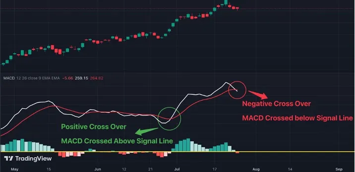
- *MACD Line and Signal Line Crosses*: These are your traffic signals. When the MACD Line crosses above the Signal Line, it's like getting a green light – a bullish signal, indicating an upward trend. Conversely, when it crosses below the Signal Line, think of it as a red light – a bearish signal, suggesting a possible downward trend.
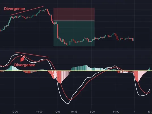
- *Divergence*: Picture this as checking your fitness tracker while you're on a walk. If you're moving forward (price going up), but your tracker shows something different (MACD Line making lower highs), it's like a warning sign. This can signal a potential change in direction.
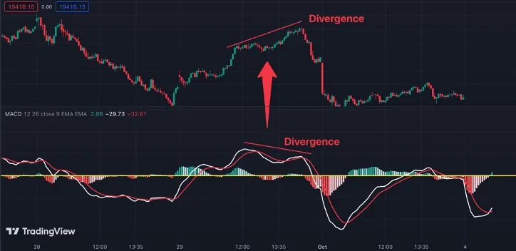
- *Histogram*: Think of the histogram as your step intensity gauge. When the bars are getting bigger, it's like you're picking up your pace – a strong bullish momentum. But when they start shrinking, it's like you're slowing down – bearish momentum and a possible trend change.
Now, let's get practical:
- Trend Confirmation: Before you set new fitness goals, you want to make sure you're on the right track. A rising MACD Line above zero line confirms an uptrend, like hitting your daily step goal consistently. A falling MACD Line below zero confirms a downtrend, similar to a trend of taking fewer steps each day.
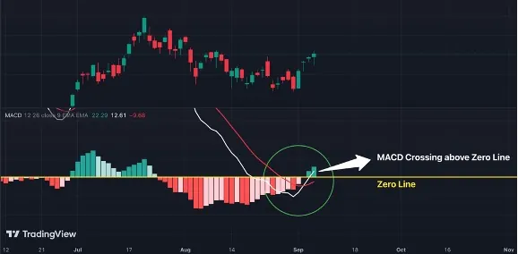
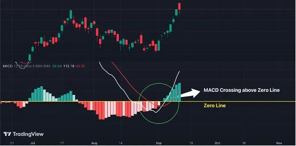
- Entry and Exit Points: When you see a green light (MACD Line crossing above the Signal Line) during an uptrend, it's a great entry point. It's like getting pumped to start your workout when you're already on a roll. Conversely, when you spot a red light (MACD Line crossing below the Signal Line) during a downtrend, it's a cue to exit or consider a break.
- Divergence Trading: Think of divergence as a roadmap to possible detours. When you see it (price making higher highs, MACD Line making lower highs), it's like a signpost for a bullish reversal. The opposite suggests a bearish reversal.
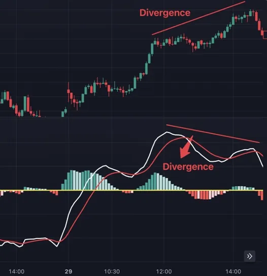
- Risk Management: Just like you adjust your workout intensity based on how you're feeling, the histogram helps you manage risk. Shrinking bars are like a low energy warning, telling you to take it easy (tighten stop-loss orders) or even take a break (exit your position).
So, there you have it, your MACD buddy – making trading as fun as tracking your daily steps! Happy Trading! 😄"
Also Read: Insider Trading: What It Is, Key Examples, and Why It’s Illegal


